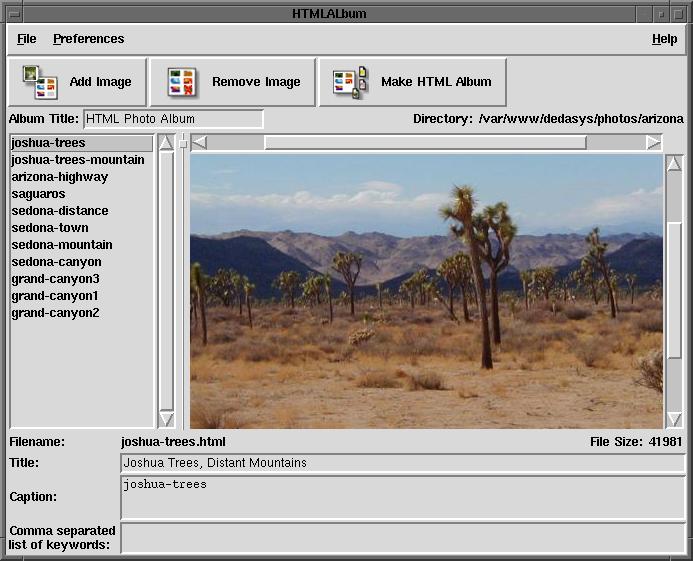
 - where, JAC (I believe) posted some nice looking defaults for Tk on Unix.I took those and tweaked them some, and here is the result:
if { [tk windowingsystem] == "x11" } {
    option add *borderWidth 1 widgetDefault
    option add *activeBorderWidth 1 widgetDefault
    option add *selectBorderWidth 1 widgetDefault
    option add *font -adobe-helvetica-medium-r-normal-*-12-*-*-*-*-*-*

    option add *padX 2
    option add *padY 4

    option add *Listbox.background white
    option add *Listbox.selectBorderWidth 0
    option add *Listbox.selectForeground white
    option add *Listbox.selectBackground #4a6984

    option add *Entry.background white
    option add *Entry.foreground black
    option add *Entry.selectBorderWidth 0
    option add *Entry.selectForeground white
    option add *Entry.selectBackground #4a6984

    option add *Text.background white
    option add *Text.selectBorderWidth 0
    option add *Text.selectForeground white
    option add *Text.selectBackground #4a6984

    option add *Menu.activeBackground #4a6984
    option add *Menu.activeForeground white
    option add *Menu.activeBorderWidth 0
    option add *Menu.highlightThickness 0
    option add *Menu.borderWidth 2

    option add *MenuButton.activeBackground #4a6984
    option add *MenuButton.activeForeground white
    option add *MenuButton.activeBorderWidth 0
    option add *MenuButton.highlightThickness 0
    option add *MenuButton.borderWidth 0

    option add *highlightThickness 0
    option add *troughColor #bdb6ad
}
JE Gnome 2.4 adds something like this to the X resource database automatically based on the selected theme. (Unfortunately the resources aren't quite right, and in typical Gnome fashion there's no way to turn this feature off.)
nl Can someone post "before" and "after" screenshots please?
Before:

After:
 (image link broken 2012-11-12)
Any particular changes from here you'd like to feed back into the code at the Tk Revitalization site?davidw I think they all read this site, and trust that they'll make use of anything good I managed to cobble together.
CL copies in comments from DKF, out of context: "Other things that I've seen done have been reducing scrollbar widths, but that only works for some windows and not others. . . . (Making editable/manipulable areas white is also a good technique, but requires more thought; not every canvas or text widget might be manipulable for example.)"
CF I found that I liked different fonts on different platforms. This works for me:
if {$tcl_platform(platform) eq "unix"} {
   set fontSize 12
}

if {$tcl_platform(platform) eq "windows"} {
   set fontSize 8
}

option add *Label.font [list arial $fontSize normal]
option add *Labelframe.font [list arial $fontSize normal]
option add *Button.font [list arial $fontSize normal]
option add *Menu.font [list arial $fontSize normal]
option add *Menubutton.font [list arial $fontSize normal]
option add *Radiobutton.font [list arial $fontSize normal]
option add *Checkbutton.font [list arial $fontSize normal]
option add *Listbox.font [list arial $fontSize normal]
AM I used these options on Solaris running CDE, I noticed the following things are missing:
option add *background gray    ;# What is the right colour?
option add *Entry.foreground black    ;# Defaults to white on my system!

. configure -background gray   ;# See general background
The strange thing is: "." is not configured via "*background" - under Windows it also gets a separate colour.
davidw Let's see... I guess having entry foregrounds be black would work. Added. In a Gtk2 app, sampling the background color gets me #dcdad5 if you want to add that in and see how it looks.PT 20-Feb-2004: Looks to me like the MenuButton entries should be Menubutton. Also the set above make frames look raised. I'd suggest adding
  *Labelframe.borderWidth 2
  *Frame.borderWidth 2
so that -relief groove still looks the way we expect.I'm a bit dubious about the padX and padY too. I don't think that they help.
Further work on what will be henceforth known as "lobster.tcl" will be done on the tklib "style" module entry, so that we can eventually package it, as well as take advantages of a revision control system. This code is available, along with the activestate style, athttp://dedasys.com/freesoftware/files/style.tgz

... another place to look for Tk look and feel on different systems is ActiveState Style for Tk

